Tuesday, March 15, 2016

Tainted Love

Smokey on the left.  Pepper on the right.
More than 20 years ago, we adopted our first dog, Pepper, and a year later adopted our second, Smokey. Now I can’t imagine life without dogs. Smokey is currently the love of my life. Yes, I’ve loved humans too; but, dog love is somehow pure. Human love is always tainted. The old saying is true: “One day, I hope to be the human my dog thinks I am.”

Pepper died on our anniversary a few years ago. We changed our anniversary date to the first day of spring. She was more than sixteen years old which is pretty good considering she was born with a heart defect. She had a heart attack due to a complication from pancreatitis. She survived a month after that; but, pulmonary hypertension finally overwhelmed her. It was so hard to let her go. It was the right thing to do.

Smokey is now over twenty. That’s pretty old for a dog. He’s blind due to complications of glaucoma resulting from cataract surgery. He’s got dementia. He needs me 24/7. I need him 24/7. I know that I won’t have him much longer. He’s been my faithful companion for a long time. It’s been such a privilege to be his human.

I’ve been looking at options for future adoptions. We would never do anything except adopt. I really feel like I’m cheating on Smokey. I do still have him. I wouldn’t get another dog until he crosses the rainbow bridge; but, I feel it’s coming soon. I’ll be taking a break when that day comes. I’ve spent all of my emotional energy on his care. I hardly leave his side.

Most of my life is simply cuddling with him on the couch. I talk to him. He grumbles back. My love is tainted compared to Smokey’s love. I see beyond the moment. I wish I could be like Smokey and enjoy life moment by moment. Be like Smokey. My new life goal.

Gloria Jones -- Tainted Love
Tainted Love

Tuesday, March 1, 2016

Infiltrative Lime Green

Sometimes, you’re drawn to colors as an artist and have no real explanation for your choices. For me, that color is lime green. The Bullseye Glass Co. calls their version of lime green “spring green;” but, it’s still lime green to me. Even though the control freak in me usually plans things down to the minutiae, I don’t necessarily plan out the color schemes when work with glass. I sometimes grab glass colors that speak to me at the moment and design on the fly.

Interchange:  Elegant Writer and a lime green NeoColor II water-soluble wax pastel on watercolor paper.
My friend, Laura Brackenis the master of restraint. I confess that I’m not really good at restraint. In most cases, that “stop now” moment only occurs after I add lime green to a piece. It’s a simple solution to every problem. If the piece isn’t working, I add lime green. It doesn’t matter if the piece starts out as red, purple, blue, or orange. In the end, lime green infiltrates into almost all of my work.
One of my favorite pieces -- Bullseye, Wasser, and dichroic glass with enamel.
I do wear a lot of green. Even lime green. It goes against all of my “autumn” color scheme; but, I don’t care. Lime green is a such a happy color. Almost every other color has a sad version -- dusty pink, colonial blue, mustard yellow. There’s no sad version of lime green.
Bullseye and Wasser glass with enamel.
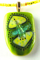
The pendant I use as my profile picture online is one of my favorite pieces that I’ve made. It’s one of the few that I’ve actually kept. Of course, it has lime green. I know that all of the artists are advised to put up pictures of themselves so their online buyers can feel more of a connection to the work. I’m pretty shy and don’t really play well with others; so, I don’t think I’ll be doing that. I’ll just put up my favorite piece I’ve ever made instead. There. That is me.
Bullseye, Wasser, and dichroic glass with enamel
My profile piece -- Bullseye, Wasser, and dichroic glass with enamel.
I’ve been playing around with color schemes for my website for a while now. The problem is that I seem to love all colors. How do you select a color scheme for your brand? I don’t really know. I think I need some professional graphics designer to help me with that one. The only thing I do know is that I must use lime green. It wouldn’t really represent me without it. I started out using a lot of turquoise and lately I’ve been coming back to it.  Maybe turquoise would be appropriate too in this transitional period in my work. Maybe turquoise and lime green.  Well, definitely lime green.