Friday, April 15, 2016

Imagine

ATC -- Art Trading Card -- Imagine -- Done While at Dale Music
The original Star Trek series ran originally from 1966 through 1969. The culture represented in that series portrayed an idealized socialism later described by John Lennon in the song Imagine. John Lennon was a dreamer. I mean that in a good way. All artists are dreamers by nature. Dreams are what drive the creative spirit forward.

What would actually happen to society if we had essentially free housing, power, and food? Would we choose to further our education? Without the actual need to provide for the basics of life, would we continue to work? I don’t know about other professions, but I do know that artists would continue to create. That’s what we do. Unless we create, a little piece of us dies.
ATC -- Art Trading Card -- Love Ya -- Done While at Dale Music
I sometimes wonder what would have happened differently in my life if I had parents who supported my artistic development. I didn’t have those parents. I had parents who ridiculed my art even when I won awards. I sometimes imagine how much farther I would be in my career as an artist. My grade school art teacher was one of the most profoundly influential esteem builders I had as a child. Mrs. Peterson. Wherever you are, thank you. You kept that dream alive in me for all those years.

With all the cuts in arts funding, I fear for the budding artists growing up. Quash their creativity by learning only those things that up the test scores for the schools. Not much of a goal for a society. Imagine what it would be like if creativity were to be allowed to flourish.

John Lennon -- Imagine

Friday, April 1, 2016

Transitional Turquoise

Turquoise and Lime Green Watercolor Study.
I love the color turquoise even though I don’t really wear it very often -- except jewelry, of course. Even so, the color turquoise keeps popping into my head when I consider colors for the farmhouse. I know that’s an odd color choice when my farm is landlocked in the mountains. Maybe it’s a transitional color for me -- signifying the change in my life from a sophisticated urban life to a more simple country life.
Fused Art Glass Pendant -- Bullseye and Wasser Glasses With Enamel.
I don’t really spend a lot of time outside in the city; but, the farm has a lot of reasons to pull me outside. I know the sky isn’t technically turquoise -- it’s azure. Turquoise has more green in it; but, turquoise is a combination of the colors I see at the farm: the azure sky combined with the green of the fields. The view at the farm is a deconstructed turquoise.
Fused Art Glass Pendant -- Bullseye and Wasser Glasses With Enamel.
Turquoise can be a little overwhelming. I don’t think I’d be comfortable in a completely turquoise room. Maybe I’ll just start small… Like the steps to the basement -- see how I like it in real life. Who knows, maybe the whole farmhouse really wants to be turquoise.
Fused Glass Pendant -- Bullseye and Wasser Glass With Enamel.
I do make and sell quite of bit of turquoise and turquoise-colored jewelry. Real turquoise is a big seller for most jewelry designers. It’s a calming color. No one has ever walked into my booth and said, “I’d NEVER wear turquoise.” The same can’t be said for other colors… like orange or yellow. Turquoise is my third bestselling color after posh purple and sophisticated teal.
Polymer/Wood Pin With Paint.
I tend to sell more turquoise glass than I do real turquoise. That’s probably because I make more glass jewelry than stone jewelry. It’s part of that ethical sourcing dilemma. It’s just so much easier to buy Bullseye glass than it is to track where the stones come from and then test them to see if they’re real and/or adulterated. Glass is just, well, unabashedly glass. It doesn’t try to impress with a pedigree (real or made up). It’s just sand and some minerals. I’ve included a few of my favorite turquoise-colored glass pendants for your enjoyment. So, enjoy.
Fused Art Glass Pendant -- Bullseye and Wasser Glasses With Enamel.

Tuesday, March 15, 2016

Tainted Love

Smokey on the left.  Pepper on the right.
More than 20 years ago, we adopted our first dog, Pepper, and a year later adopted our second, Smokey. Now I can’t imagine life without dogs. Smokey is currently the love of my life. Yes, I’ve loved humans too; but, dog love is somehow pure. Human love is always tainted. The old saying is true: “One day, I hope to be the human my dog thinks I am.”

Pepper died on our anniversary a few years ago. We changed our anniversary date to the first day of spring. She was more than sixteen years old which is pretty good considering she was born with a heart defect. She had a heart attack due to a complication from pancreatitis. She survived a month after that; but, pulmonary hypertension finally overwhelmed her. It was so hard to let her go. It was the right thing to do.

Smokey is now over twenty. That’s pretty old for a dog. He’s blind due to complications of glaucoma resulting from cataract surgery. He’s got dementia. He needs me 24/7. I need him 24/7. I know that I won’t have him much longer. He’s been my faithful companion for a long time. It’s been such a privilege to be his human.

I’ve been looking at options for future adoptions. We would never do anything except adopt. I really feel like I’m cheating on Smokey. I do still have him. I wouldn’t get another dog until he crosses the rainbow bridge; but, I feel it’s coming soon. I’ll be taking a break when that day comes. I’ve spent all of my emotional energy on his care. I hardly leave his side.

Most of my life is simply cuddling with him on the couch. I talk to him. He grumbles back. My love is tainted compared to Smokey’s love. I see beyond the moment. I wish I could be like Smokey and enjoy life moment by moment. Be like Smokey. My new life goal.

Gloria Jones -- Tainted Love
Tainted Love

Tuesday, March 1, 2016

Infiltrative Lime Green

Sometimes, you’re drawn to colors as an artist and have no real explanation for your choices. For me, that color is lime green. The Bullseye Glass Co. calls their version of lime green “spring green;” but, it’s still lime green to me. Even though the control freak in me usually plans things down to the minutiae, I don’t necessarily plan out the color schemes when work with glass. I sometimes grab glass colors that speak to me at the moment and design on the fly.

Interchange:  Elegant Writer and a lime green NeoColor II water-soluble wax pastel on watercolor paper.
My friend, Laura Brackenis the master of restraint. I confess that I’m not really good at restraint. In most cases, that “stop now” moment only occurs after I add lime green to a piece. It’s a simple solution to every problem. If the piece isn’t working, I add lime green. It doesn’t matter if the piece starts out as red, purple, blue, or orange. In the end, lime green infiltrates into almost all of my work.
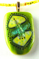
One of my favorite pieces -- Bullseye, Wasser, and dichroic glass with enamel.
I do wear a lot of green. Even lime green. It goes against all of my “autumn” color scheme; but, I don’t care. Lime green is a such a happy color. Almost every other color has a sad version -- dusty pink, colonial blue, mustard yellow. There’s no sad version of lime green.
Bullseye and Wasser glass with enamel.
The pendant I use as my profile picture online is one of my favorite pieces that I’ve made. It’s one of the few that I’ve actually kept. Of course, it has lime green. I know that all of the artists are advised to put up pictures of themselves so their online buyers can feel more of a connection to the work. I’m pretty shy and don’t really play well with others; so, I don’t think I’ll be doing that. I’ll just put up my favorite piece I’ve ever made instead. There. That is me.
Bullseye, Wasser, and dichroic glass with enamel
My profile piece -- Bullseye, Wasser, and dichroic glass with enamel.
I’ve been playing around with color schemes for my website for a while now. The problem is that I seem to love all colors. How do you select a color scheme for your brand? I don’t really know. I think I need some professional graphics designer to help me with that one. The only thing I do know is that I must use lime green. It wouldn’t really represent me without it. I started out using a lot of turquoise and lately I’ve been coming back to it.  Maybe turquoise would be appropriate too in this transitional period in my work. Maybe turquoise and lime green.  Well, definitely lime green.

Monday, February 15, 2016

A Kiss From a Rose

Heart of Gold -- watercolor and ink.
I have a love/hate relationship with roses. I have three distinct memories associated with roses. My parents grew roses when I was a kid. I tried to make rose perfume. Well, sort of a rose perfume. I threw scented rose petals into rubbing alcohol and let them steep. What I got was rose-scented rubbing alcohol. Not exactly what I expected. It would have been smarter to steep them in vodka; but, my parents didn’t drink alcohol. Kids...

My second rose-scented memory reminds me of my grandmother. Her house backed up to a working farm that was sprayed with some chemical that smelled like roses. To this day, my grandmother’s house comes back in perfect clarity whenever I smell that roses.

My third memory is rose-scented Turkish candy. I was in a Middle Eastern market one day and stumbled across Turkish candy. Naturally, I had to have some (we were adventurous eaters in my family). I’m sure that they were quite excellent to most people. To me, they reminded me of insecticide and grandma.

So, with all of these negative associations with roses, why am I considering planting roses? Well, I’m thinking of Rugusa roses. They have beautiful flowers with nasty thorns. The beauty is that they don’t get a lot of the nasty diseases normally associated with roses. That means no chemicals needed to grow them. In addition, they produce enormous rose hips loaded with Vitamin C. You can dry them and use them later to make tea. Stuff like that is important on a farm. We are miles from things like doctors and grocery stores. A reasonable amount of self-reliance is required. So, the roses are going in… Somewhere where it will be hard to brush against them.

Sometimes in life, things don’t work out as expected. Ok. They almost never work out as expected. When Seal wrote “A Kiss From a Rose,” he wasn’t happy with it and tossed it aside. Years later, it became a mega hit. When I wrote this post, I was confident that I could get a decent rose painted with watercolors. Nope. Several tries. Not even close. I guess that a single watercolor class doesn’t make you brilliant. Who knew? So, instead, I drew a heart. Enjoy.


Seal -- A Kiss From a Rose
A Kiss From a Rose

Monday, February 1, 2016

Duplicitous Pink

Pink is a duplicitous color. I tend to think of pink paint as being a mixture of white and red. That works unless you are doing traditional watercolors that only allows for the white of the paper. The first thought is that you can get pink from an unsaturated or watered-down red. ummmm... no... If you water down red and apply it lightly over the white paper, what you really get is pale red. That may work for some applications; but, when you paint flowers, you need a saturated pink. Sigh... My hopes for a limited watercolor palette have been foiled again.
Select pink and red Winsor & Newton watercolors.
I picked up Quinacridone Magenta, Rose Madder Genuine, and Opera Rose watercolors to fill out my need for pink. I am taking a watercolor journaling class from Jane Lafazio.  I'm not very far into the course, but I took some time to do some spring flowers -- they're supposed to be cherry blossoms. I guess all of the snow has made me long for spring.
Spring will come.
Pink is one of those colors that looks good on most people. I love pink but I don't tend to wear it. I'm not sure why that is. Maybe it's from being in a male-dominated career for so long. I don't make a lot of pink jewelry because it doesn't sell well for me. When I do break down and make something pink, it's usually in some bright version like magenta or fuchsia. I'm not much of a pastel person. I have made pink versions of my favorite earring design -- Swarovski cubes like the ones pictured below.

Fuchsia Swarovski crystal cubes.
I even caved and made the trendy Swarovski hearts for a while. They were fun to figure out. The directions I read were pretty confusing. Much easier to just figure them out on my own. That's what I did with the cubes too. Just played with beads until I understood the pattern.
Swarovski puffy heart.
Pink glass is usually very expensive when it's colored with gold salts. I've done some pendants that used pink glass; but, I seldom use it as the sole color. Pink jewelry doesn't seem to sell well for me. This pendant was made with Bullseye glass, Wasser glass, and enamels. Much to my surprise, this pendant sold almost immediately.
And..... sold....
My favorite pink pendant is shown below. I intended the dichroic strip to be somewhat offset. I made it after a rough patch and was feeling a little bit off-center. I thought that my pendant should reflect that.
Feeling a bit off.
One of my favorite color combinations is pink and lime green. Lime green is actually one of my infiltrative colors. Most of my glass somehow ends up with flecks of lime green. It's actually called "Spring Green" when it's manufactured by Bullseye. Colorline Paints (for glass) come in lime green. I haven't bought that shade yet, but I'm sure I will. I'm a sucker for glass. And, yes... I need to have every color that's manufactured...
Pink pendant with infiltrative lime green.


Friday, January 15, 2016

Just Be

There's nothing like ending up in the ER to help you set your priorities. I've been on auto-pilot for a while trying to keep it all afloat. Getting my studio into working order. Cleaning and organizing the houses. Taxes. Identity theft. Dog. Classes. Juggle, juggle, juggle... Then, suddenly, I'm in the ER trying to figure out what is really important. Well, of course DOG is important. He does take up a lot of my time and I'm more than willing to be his caretaker human.
Color mixing -- French ultramarine blue, permanent Alizarin crimson, cadmium yellow.
I had quite a bit of time to reflect on my uncomfortable hospital cot. No TV or radio. Just me and my journal. This is what I learned: I need more joy in my life. By nature, I'm a very serious person. Chester has helped me find the goofy in life. His favorite saying is that everything is funny given enough perspective. He's helped me be able to laugh at myself. That's important in life. Still, I've been wrapped up in guilt recently because my To-Do list seems to be getting exponentially larger every hour.
Color chart for Jane LaFazio's watercolor class on recommended hot pressed paper.
My life need to change or at least rearrange. I have started to allow things to resolve themselves without my intervention. This goes against my helpful nature; but, I need to start taking care of me a little bit better. I'm stretched too thin especially for someone with a heart condition.
Color chart on my favorite type of watercolor paper: cold pressed.
I've started sketching again this year. I haven't done it since I was in middle school which was about forty years ago. Except for one year of engineering drawing, the only sketching I've done is jewelry. Forty years is a long time to abandon a skill. I've got a lot of practicing to do before I get back to where I was in middle school.
Brushes, pencil sharpener, water soluable pens and pencils, Schmincke travel set watercolors. 
Twenty years into Gingrich's Fiber & Metal Art, I'm finally investing in a skill set without an immediate monetary benefit. In addition to my daily sketch (you can follow my progress on Instagram -- Gingrich's Fiber & Metal Art. I'm also taking a watercolor class from Jane LaFazio. So far, I've done the first lesson. Both the sketching and class progress were interrupted by my little hospital stay.
Winsor & Newton watercolors, pencils, waterproof markers, erasers.
For the watercolor class, I've done swatches and played with color mixing on various watercolor papers. This is the first time I've actually used professional watercolors. The swatches were done with Winsor & Newton professional series with the colors specified by Jane for the class. I also bought some Schmincke and Daniel Smith watercolors. I'm looking forward to playing with them too. I'm sticking to the W&N for the class though.
Watercolor paper we're using in class.
So, my life is changing and rearranging. I want the joy to stay. Other things are going to be left behind. Most of all, I'm just willing to let things Just Be and let them resolve of their own accord. I don't need to fix it all. I can just be in the moment... at least I think I can...

Ashley Jana -- Just Be
Just Be


Saturday, January 2, 2016

Looking at 2016 -- Focus

I don't tend to make New Year's resolutions. I have an unrealistic view of how much I can accomplish and the amount of interest I have in doing certain things. New Year's resolutions only make me angry at myself for failing to meet my unrealistic expectations.

Instead of New Year's resolutions, I have a series of goals I to attain this year. First on my list is improving my drawing skills. As an action towards this goal, I'm taking Jane LaFazio's Sketching & Watercolor class that starts in a few days. If anyone is interested, here is the link for the course:

Jane LaFazio's Sketching & Watercolor: Journal Style ~ January 2016

In addition, I have been doing sketches in preparation for the course. So far, I have been doing a sketch a day, but my actual goal is to simply do a lot of sketches. No need to stress out if my life interferes and I miss a day. If you want to follow along and see my progress, (like you have nothing else to do, of course), I'm posting the sketches on Instagram. I'm gingrichsart.com_ if you don't want to click on links.

Instagram account for gingrichsart.com_

This brings me to my personal word for the year. I was going to go with two words -- Just Be. It struck me that you're supposed to pick just one word. So, this year's word for me is FOCUS.

My life is completely run by my 20-year-old dog, Smokey. He's quite the demanding task master. Bark, bark, bark and mommy springs to action. It's hard to focus with the amount of sleep I'm getting and I seldom get more than 20 minutes of uninterrupted time. It doesn't matter. He's worth it. I appreciate the very long time I've been his human.

I know that the personal word for the year is supposed to give you focus. However, since my biggest challenge is the ability to focus, I'm just going to choose the word Focus. Focus on my life and stop spinning my wheels. Focus my studio into an efficient and inspiring place to work. Rid my life of unnecessary distractions so I will be better able to focus. Read more which will help me focus.

FOCUS -- FOCUS -- FOCUS -- FOCUS.

Friday, January 1, 2016

Quixotic White

Typically, my New Year starts with resolutions that are quickly broken -- mostly because my resolutions are idealistic, unrealistic, and impractical. That’s how I view the color (or non-color) white. It takes me only seconds to get white clothes dirty.  Here is my interpretation of tying up loose ends.

Tying Up Loose Ends -- Mixed Media.
Our little farmhouse is painted quixotic white. It’s probably never really been truly white for more than a few minutes. Dirt is part of life in the country. From the road, our house looks pretty dingy. The gray shutters blend seamlessly with the supposedly white house. It's still a white house. Just not the white you expect to see in a white farmhouse.

Quixotic white farm house.
The fancy word for white is achromatic -- color without color. It is mixture of all of the colors in the light spectrum that magically cancel out each other leaving no trace of color. In theory, I love the concept of white walls because it would keep the colors of my art collection true to the artist's vision. In real life, white walls make me uncomfortable. I keep seeing all the marks and all of the imperfections in the walls.


White flowers of a castor bean.
I find it hard to make white jewelry look anything but cheap.  Well, unless I'm using high-end pearls. I tend to think of white jewelry as wedding jewelry or a throwback to the 50's plastic parures. I have a drawer full of white beads that I bought before I figured this out. I do have some gorgeous white beads made by Amber Ballad that don't look cheap. They're covered in pixie dust and quite fun. I will try to do justice to them one day soon.


Field of Queen Anne's Lace overlooking the barn.
There are an astonishing variety of white flowers in the wild. White in nature is almost always accompanied with a variety of green. I love our meadow with it's sea of Queen Anne's Lace. It's always a bit sad to have it cut for hay for the neighbor's sheep. At least until you meet the sheep. They're pretty goofy.

Neighbor's sheep.
White reflects and amplifies surrounding colors. It has an wide range of tints that are all considered to be white. In the end, white is an honest color. It is what it is. Other colors like pink are more duplicitous... But, that's another story.
Various tints of white.